interiors

Steps to Creating the Perfect Work From Home Office Space

Creating the perfect home office space can be a challenge, especially if you have limited space or are working with a tight budget. But with a little creativity and some careful planning, you can create a functional and stylish home office that will inspire you to be productive and efficient.

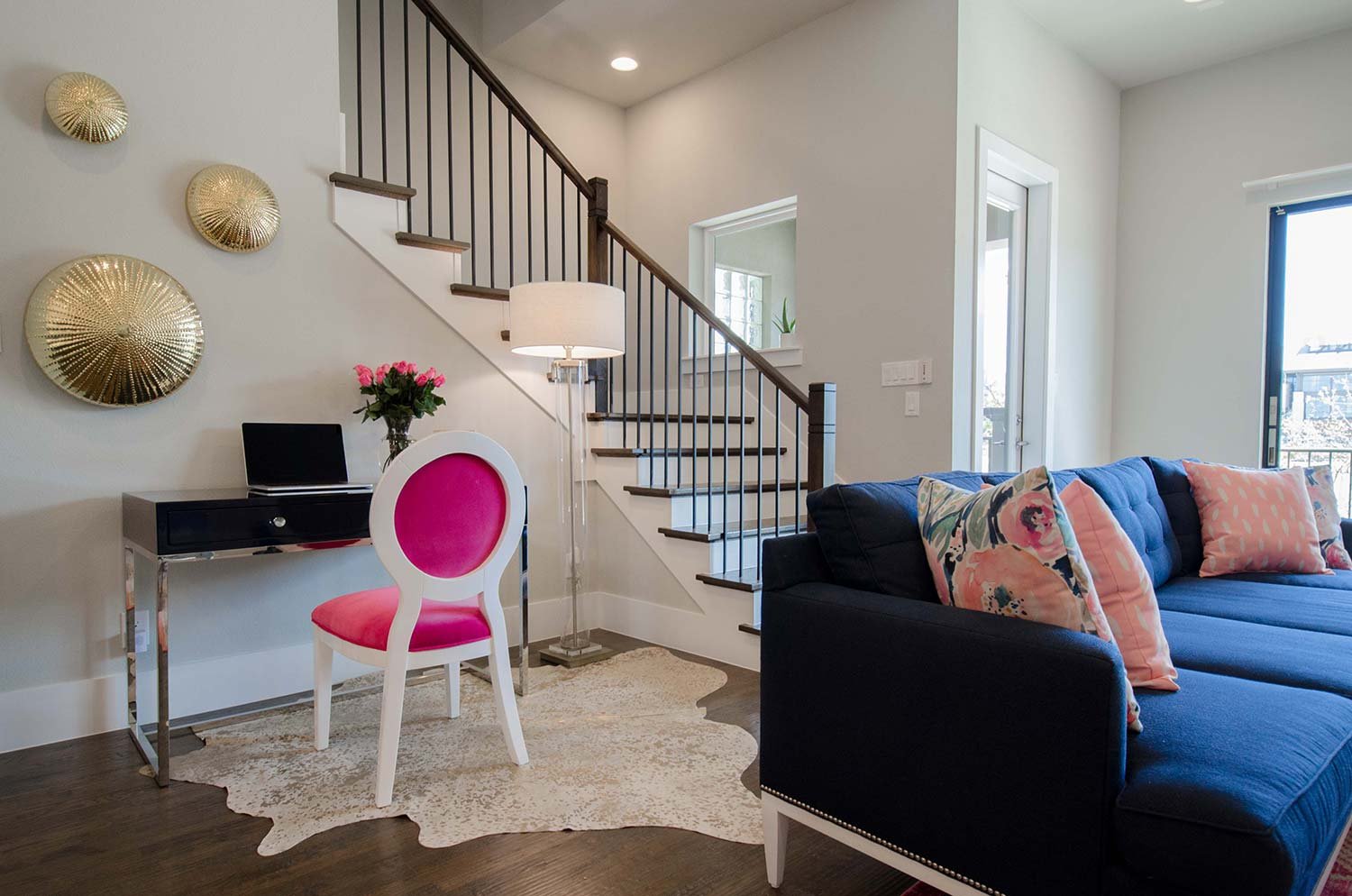
First, consider the size and layout of your space. If you have a dedicated room for your home office, you may have more flexibility in terms of layout and design. But even if you only have a small corner of a room to work with, you can still create a functional and comfortable space.

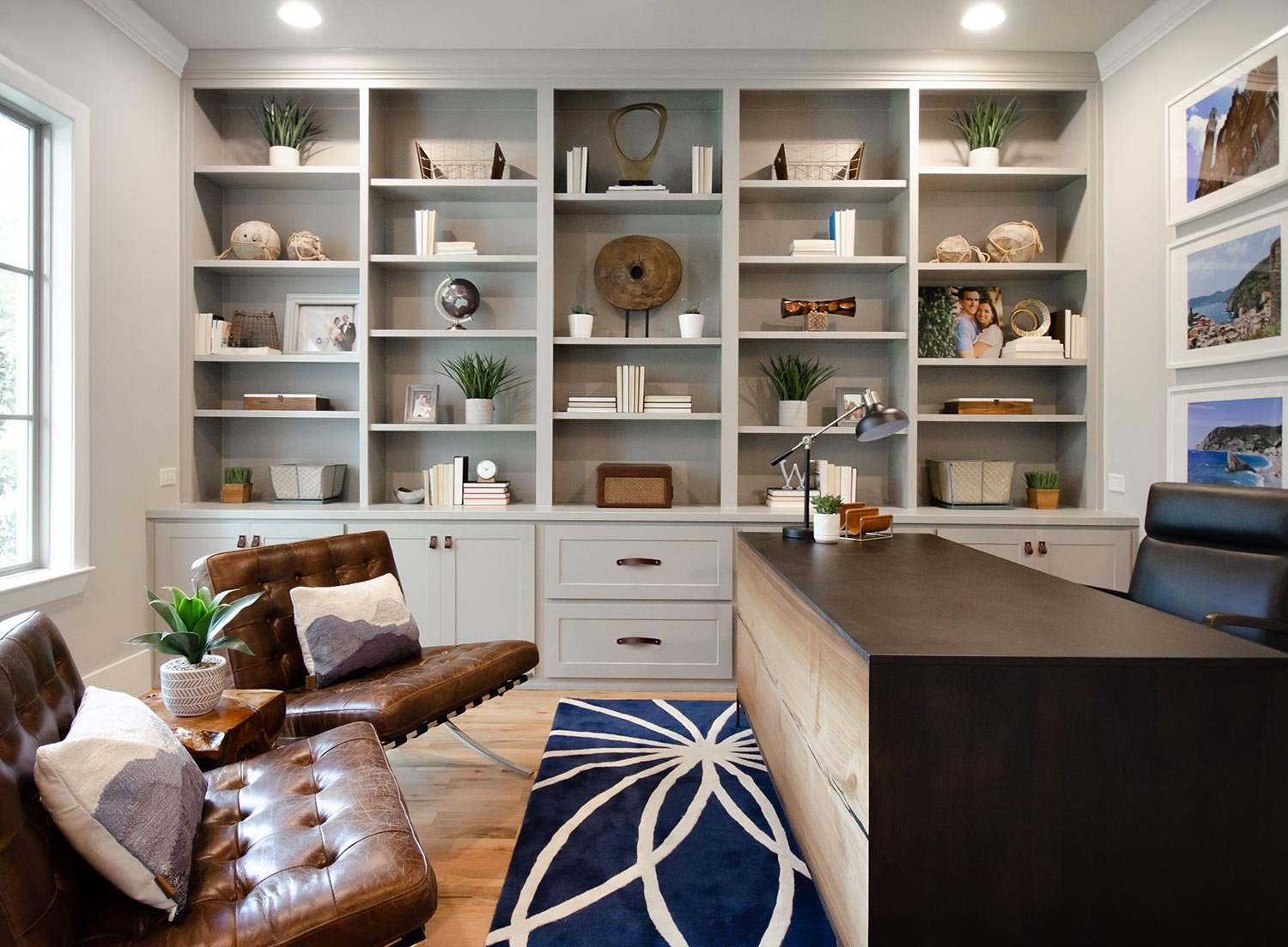
Next, think about the tasks and activities you will be doing in your home office. Do you need a large desk for your computer and other office equipment, or will a smaller workspace be sufficient? Do you need storage for files and documents, or can you keep them digitally? Consider what you will need in your home office and plan accordingly.

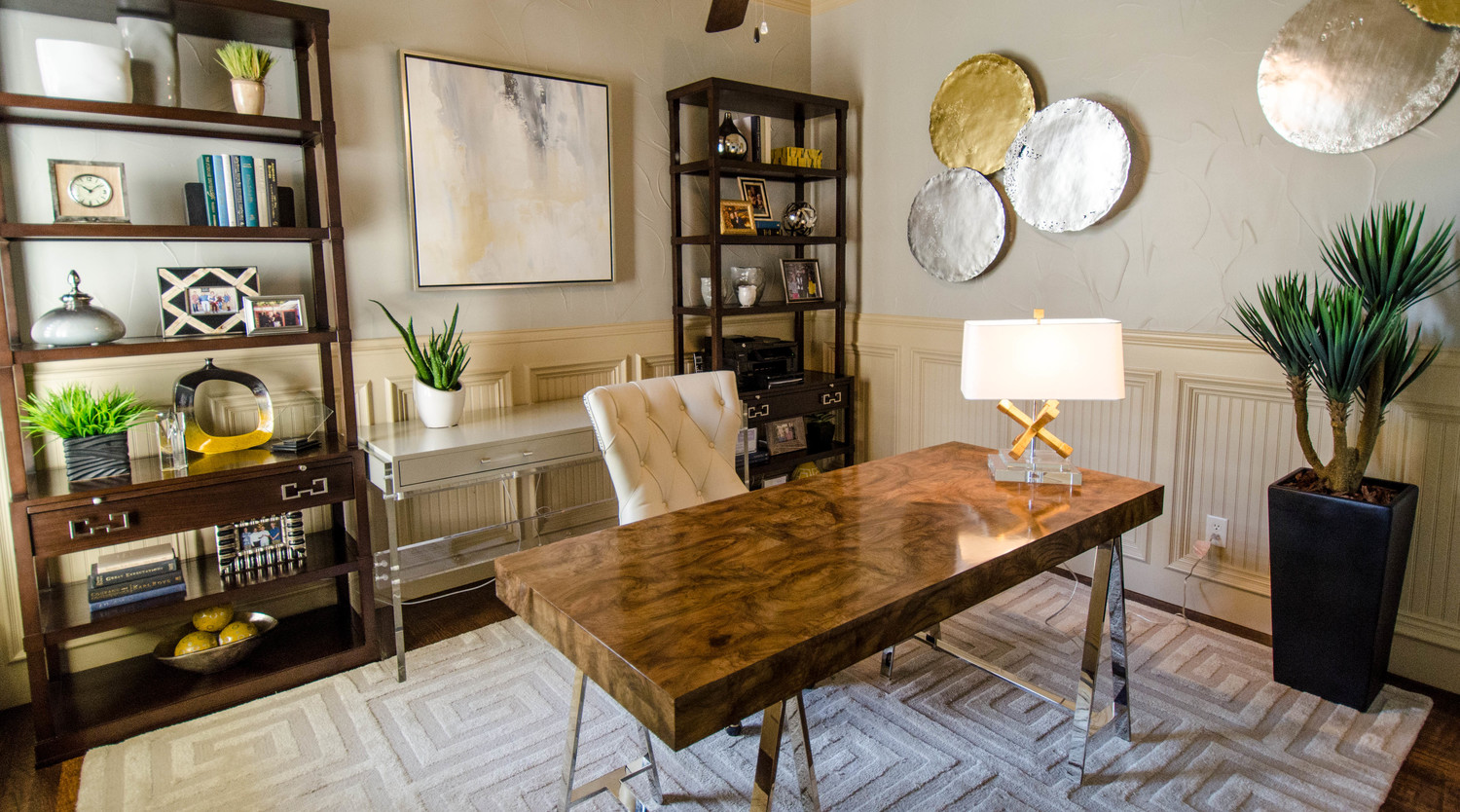
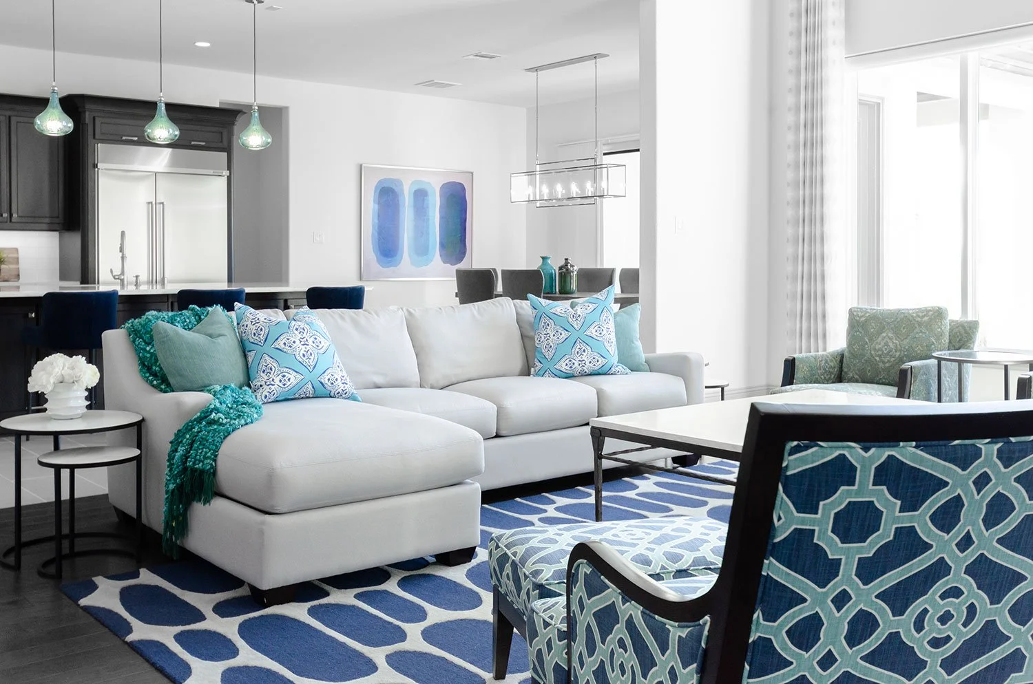
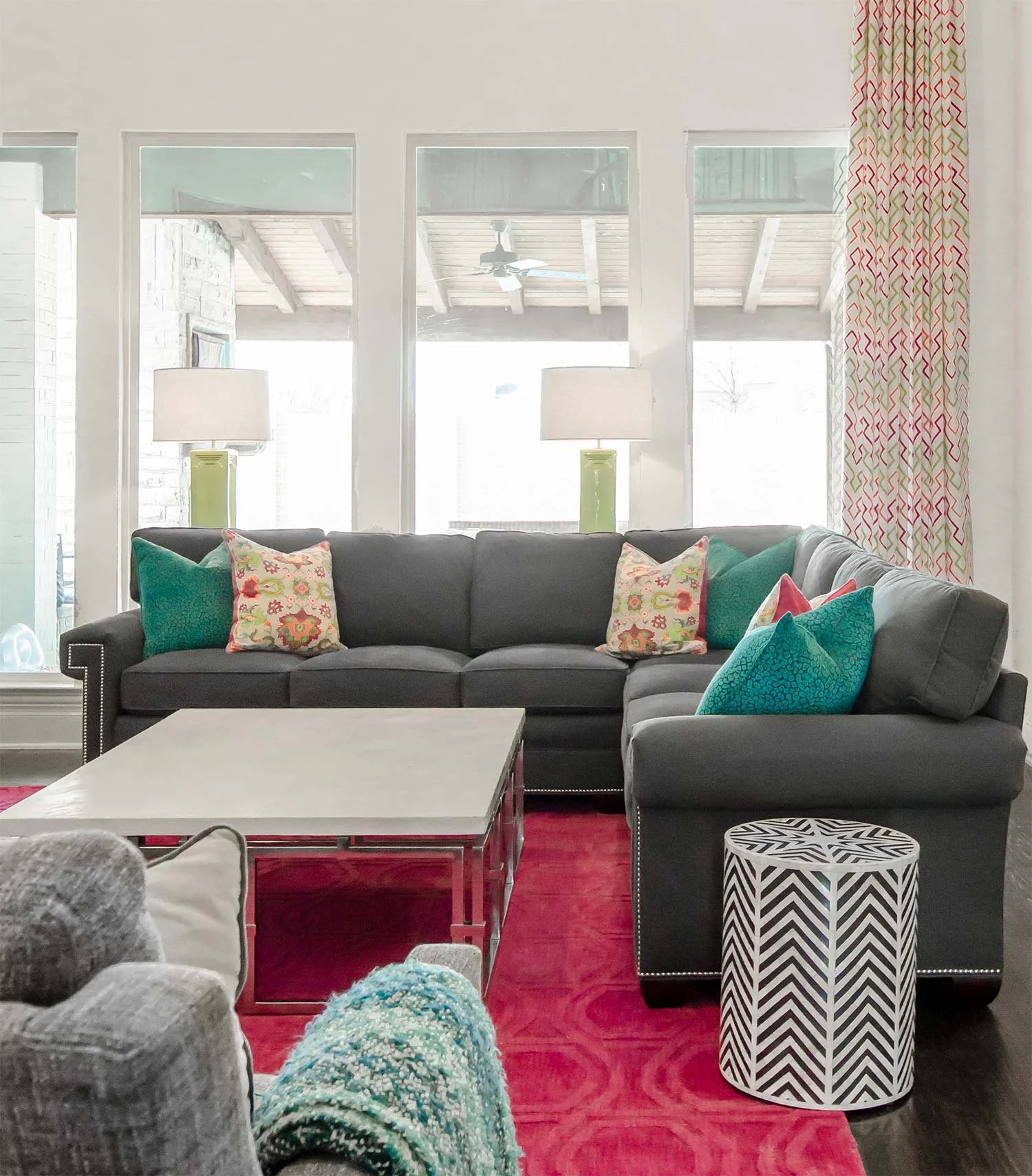
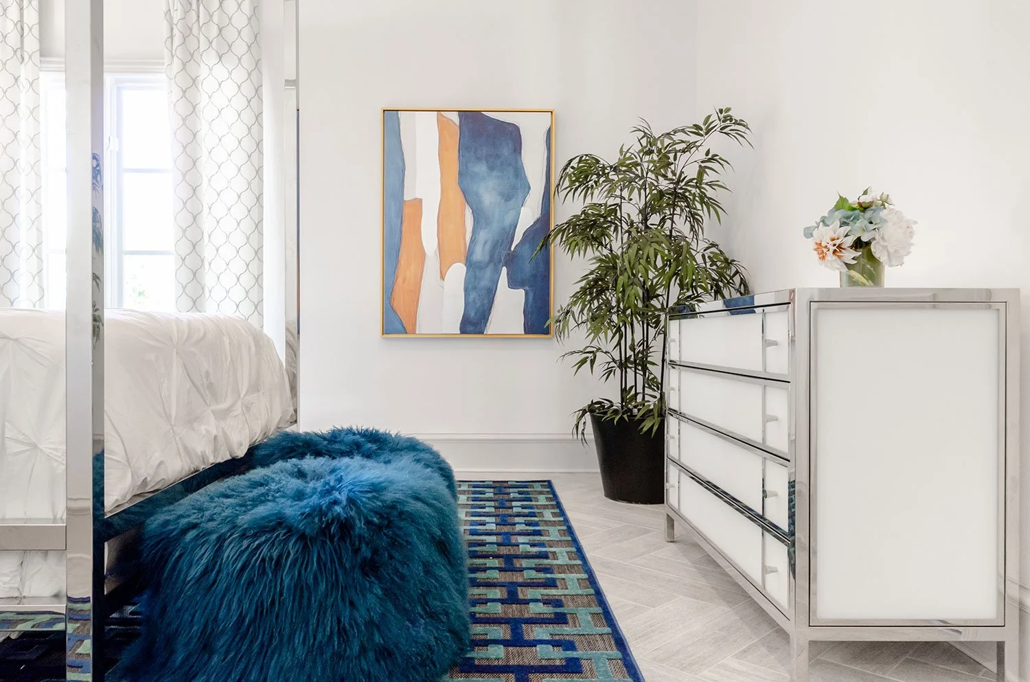
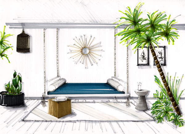
Once you have a clear idea of the layout and functionality of your space, it's time to think about design. Choose a color scheme that is both calming and energizing, and incorporate colors and patterns that will inspire you and boost your mood. Add personal touches, such as family photos or artwork, to make your home office feel like your own.

When it comes to furniture, choose pieces that are both functional and stylish. A comfortable and supportive chair is essential, as you will be spending a lot of time sitting. A desk with plenty of workspace and storage is also important, as is lighting that is both functional and ambient.

Finally, consider incorporating plants and other natural elements into your home office design. Not only do plants add a touch of life and color to your space, but they can also improve air quality and reduce stress.

aqua and pink interior design accents

By following these simple tips, you can create the perfect home office space that is both functional and stylish. With a little effort, you can create a space that will inspire you to be productive and efficient, and that you will enjoy spending time in.

10 Ways to Add Color to Your Home

Adding color to your home can be important for a variety of reasons. Color can affect our mood and emotions, so choosing the right colors for your home can help create a warm and inviting space that makes you feel happy and comfortable. In addition, using color in your home can also be a great way to express your personal style and add visual interest to a space. Adding color can also be a practical way to help define different areas or zones in an open floor plan, making a space feel more cohesive and functional. Here are 10 easy ways to add color into your home design.

TEN: Add colorful throw pillows or blankets to your living room or bedroom

NINE: Hang colorful artwork on your walls

modern art in traditional home

EIGHT: Use colorful rugs to define spaces and add pops of color

modern home design using shades of blue

SEVEN: Add plants with colorful leaves or flowers to bring life and color to your space

pink orchid on coffee table

SIX: Use colorful dinnerware and glassware to add a pop of color to your dining table

organic boho style plates and cups

FIVE: Incorporate colorful accents, such as vases or lamps, into your decor

colorful entryway design

FOUR: Paint one wall in a bold, vibrant color as a focal point

transitional bedroom design with teal wood paneled wall

THREE: Use colorful window treatments, such as curtains or blinds, to add color to your windows

custom hot pink interior design

TWO: Add colorful furniture, such as a brightly colored sofa or armchair

ONE: Use colorful wallpaper to add pops of color and style to a room.

hanging pendants over night stands

Crisp & Bold Bedroom Suite Design

Originally this space was your traditional early-2000’s bedroom converted into a home office. Imagine cherry wood tones, plush beige carpeting in the bedroom, and green tiled floors, shower, and countertop in the bathroom. Needless to say, this room was in need of an update. With a dedicated home office in another part of the house, there was not a need for this space anymore, so we decided to transform it into a hotel-chic inspired guest bedroom suite.

best interior designers in Portland Oregon

A chrome four-post upholstered bed was chosen to visually raise the height of the room. Flanking oversized hanging lights bring home that hotel-chic style. The bold colors pop against a crisp white wall and taupe molding.

update bedroom design Portland Oregon

In order to add warmth to this crisp bedroom design, the trim was painted a warm taupe, gold accents were, and touches of warm jewel tones were layered throughout.

custom drapery design Portland Oregon

Classic herringbone tile flooring has a high-end custom style with layers of pattern and color around.

Carrara Marble countertop and marble mosaic tile in bathroom design

Mixing chrome and gold accents created modern interest. Because this bathroom is on the smaller side, a lighter wall colors and bright Carrara marble were chosen to maximize airiness.

brushed brass shower system with waterfall shower head

Mixing a modern wave ceramic tile with a waterfall of petal-shaped laser cut marble creates a timeless yet whimsical shower design. Bold brushed gold waterfall shower head and hand shower elevate the style perfectly.

A bold teal color was chosen to seamlessly flow with the color scheme in the bedroom and add the unexpected punch of fun in this bathroom.

modern transitional bathroom design NW Hills Portland Oregon

Edgy polished chrome faucet and modern marble countertops create a cool juxtaposition in style and texture.

paint refresh on cabinetry

Simple brushed gold hardware contrast against the teal bathroom vanity. The circular shape soften the paneled door fronts of the cabinetry.

top Lake Oswego interior design firms

The colors for this bedroom started with a crisp white, a layering in of saturated jewel tone blues, and finished off with metallic accents. This truly encapsulates the hotel chic ambience.

Large pendant lights handing over nightstands

Balance and scale was artfully played with to create a completely unique and curated look.

custom furniture maker Portland Oregon

A bold turquoise color brings personality into this guest bedroom. The top is glass to keep things feeling light and airy and the bottom has storage to keep those tables, books, and other goodies guests may need during their stay. Custom gold hardware on these turquoise nightstands add a sophisticated tailored element created an understated elegance.

Modern bedroom furniture Portland Oregon

Live house plants bring life, natural color, and texture into every space. It also acts to frame this wonderful piece of modern art.

Fur pouf ottomans at the food of modern bedroom bed

Guests are surrounded in luxury with stylish elements such as white glass dresser trimmed in chrome. You can see the fantastic elongation of the tile in this photo as well.

Lake Oswego custom tailored pillows

The pillows on the bed embrace the maximalist design principal where more is more. We celebrated this in an artful way by combining mixed colors, textures, and sizes.

Modern luxurious interior design trends Portland Oregon

The shape of the oversized hanging light adds a nice softness to this bedroom suite retreat. Because the shade wraps around the edge of the drum, light is perfectly diffused to avoid harsh direct light to guests.

home staging accessories in Portland Oregon

To finish off this bedroom, we curated artistic designer cocktail table books, added modern sculptural pieces, and custom designed floral.

Color Crush: Shades of Pink

Color Crush: Shades of Pink

Pink is in the house! I haven't seen an interior color trend take over so quickly since shades of grey and I have to admit, I am on board! Shades of pink even made me Top 5 things I just can't get enough of for Spring. Here are some of my favorite examples of pink being used in todays interiors.

Learn to hand render like the pros!

Have you ever seen a hand rendered design and thought, "WOW, how do they do that?" or, "I'll never be able to hand render like that." I am an interior designer and I also have those same thoughts. In college I had to learn the skills of hand rendering, however, with such a fast paced world, it was one of the skills I let slip. 

I recently reconnected with a friend from university, Shannin Williams, and she absolutely  amazed me. Shannin has fine tuned her hand rendering skills since our time as Lumberjacks at SFA in Nacogdoches, TX.  "My goal is to help you learn the basic techniques of hand rendering and sketching and apply those to your client presentation boards in a creative way so you can sell your design proposal." Shannin says. I love how she inspired me to get back to the basics by putting pen to paper and immerse myself into my designs on another level. Here are some of the tips she gave me for sharpening my hand rendering skills that will help you too.

Sannin Williams hand rendering interior design

Tip 1 - Use good quality paper.

Using good quality paper can change the way the final rendering can look. I’ve used several types of marker paper and I discovered the ones I like the most. If I want my hand rendering to have a softer look I use Bienfang Lightweight drawing paper. This paper allows the marker to bleed perfectly for me. If I want a sharper look with defined strokes and marks and no bleeding I use x-press it blending card. Others I use are Canson pro layout marker paper, and Borden& Riley #234 bleedproof paper. I suggest trying a variety of papers until you find the one you like and achieve the look your aiming for. See more of my favorite tools in the link here

Canson marker pro rendering

Tip 2- Use a straight edge when you hand render or draw. 

I always use a triangle that has an inking edge when I draft floor plans or hand render. The purpose is to keep your marker lines straight. I like seeing crisp, straight lines in my illustrations. A crooked line makes me nuts which is why I own several adjustable triangles in different sizes. My favorite is the Staedtler Mars 8” adjustable triangle. I even keep a smaller one in my purse when I travel along with a sketchbook, pen, and pencil. 

Sketches of architectural and design rendering tools

Tip 3 - Use good quality markers. 

I use Copic Sketch markers due to the 380 + colors they offer. I also like Copic Sketch markers because you can refill them and change the tips when they get bad. Buying a $6 marker seems outrageous but I look at it as an investment since I have the ability to refill them when needed. That beats buying a whole new marker like you would with other brands. If you want to start with a set of markers I recommend purchasing any of the Copic Sketch cool, toner, neutral, and warm gray markers first. You can achieve a lot of colors with a range of grays. And don’t be afraid to layer and mix your marker colors to create a new color. 

Markers and Ink rendering


Tip 4 - Define your own style of hand rendering. 

There are several architectural illustrators out there that have different hand rendering techniques. I have learned from them all and developed my own rendering style that portrays the look I want to achieve. My style includes a loose and quick mark that is not perfect allowing my final hand rendering to be natural and not forced. It took me months of practice to achieve the style I wanted and I recommend you doing the same. Your style of hand rendering needs to stand out amongst others to get gain attention. 

Hand rendered interior design. Tropical boho style design.
Hand rendered entry design by Shannin Williams
Hand rendering interior architecture and design

To see more of my work visit my website at www.shanninwilliams.com or follow me on instagram @shannin_williams. If you want to practice hand rendering jump on my website and sign up for my mailing list and download your free line drawing or you can see try out my hand rendering course here.

Shannin Williams Interior Designer